Visualize, simulate and design for access
“How UNDP is Rethinking Data to Tackle Fragility” feat. Data Futures Platform, Crisis Risk Dashboard and SURGE Data Hub
UN Secretary-General’s Data Strategy calls for building a whole-of-UN ecosystem to unlock the full data potential of the organization. It says that by concentrating on “data use cases” that address pressing challenges, we “learn by doing” and raise the chance of success in our work.”
Building on these guiding principles, United Nations Development Programme’s Global Policy Network’s Data Hub is rethinking how data can be used to address fragility and define the organization’s work in crisis. In a recent Development Dialogues session, different teams from within the Global Policy Network showcased innovative approaches to risk monitoring and data analysis to:
1) Measure and address fragility and risks of crisis
2) Build forward better
1) Data to create taxonomies

UNDP’s Fragility Model is a measure of fragility that is data-driven and based around the 4Ps that form the core of UNDP’s work — People, Planet, Prosperity and Peace. Two main ideas behind the model are:
· Uncovering hidden fragilities
· Focusing on fragile cities and groups
Why this is important: Fragility models tend to focus on similar indicators on a broader national level. Being able to zoom in on the level of cities and different fragile groups helps uncover valuable information which can be used to create new policy models and taxonomies.
2) Data for simulations

UNDP’s Data Futures platform aims to support countries in socio-economic recovery (post-COVID) and help decision-makers manage uncertainty around governance, social protection, green economy, and digital disruption. Two key features:
· Policymaking through projections
· Supporting Vaccination Rollout
Why this is important: The platform takes data on areas related to COVID recovery and allows users to ask “what if” questions. Through country-focused simulations, decision-makers can make projections and compare different possible outcomes. It is also supporting national vaccine rollout through multi-dimensional data to ensure no one is left behind!
3) Data through visualization

Multidimensional Poverty Index pilot from UNDP Bangladesh showcases the power of data visualization by using data on poverty, social safety nets, and other indicators down to a district level. Two key aspects:
· Think in 3-dimensions
· Think data sources
Why this is important: Integrating different sets and layers of data and visualizing across different indicators allows policymakers to identify gaps and patterns and get an incisive picture of fragility. However, it’s not always easy to get the data. There is a need to think creatively and check all the sources, especially the ones published by the government.
4) Risk monitoring through crisis dashboards
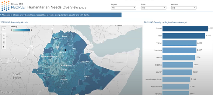
Crisis Risk Dashboard (CRD) is a platform for data aggregation and visualization to support contextual risk analysis of a country. For UN Ethiopia, it supports monitoring and analysis of risks to development and guides UNDP’s work on People, Peace, Prosperity and Planet. Two key aspects:
· Monitoring UNDP’s impact
· Integrating social media
Why this is important: Does conflict intensity decrease with a UNDP intervention? The dashboard allows users to analyze the impact of UNDP’s work in different geographical hotspots and among various populations. Next, the CRD is integrating social media to monitor the impact of hate speech in the country.
5) Data as a workflow language
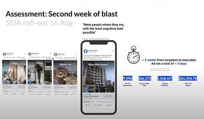
Socio-Economic Impact Assessment (SEIA): UNDP Lebanon, supported by the SURGE Data Hub and Accelerator Lab, conducted a SEIA immediately after the Beirut blast. SURGE Data Hub had supported the assessment in 45 countries previously but the context here was different as people were now homeless and going through extreme trauma. Two key features:
· Trauma-informed SEIA
· Data as a workflow language
Why this is important: UNDP Lebanon used Facebook to reach around 10,000 people in two weeks so they could respond without having to directly engage with the surveyors. To allow continued engagement with the assessment data, it built the SEIA explorer that visualizes data for all the people assessed and shows how UN work is impacting their lives.
Watch the complete event below: